Audi Introduces New 2D Brand Logo

Highlights
- Audi has introduced a new 2D brand logo.
- The design of the logo remains same but the finish is entirely new.
- The new logo is flatter than the outgoing one.
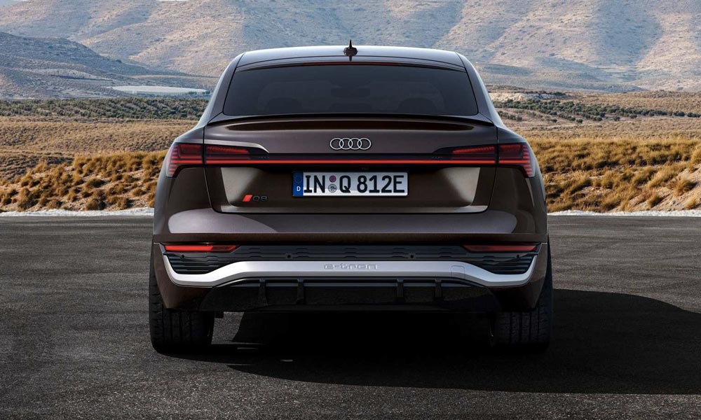
Automakers have been revising their brand logos of late and joining the latest trend is Audi that recently revealed its brand new 2D logo. Now the design and dimensions of the logo remain the same, but it's the appearance that has become more contemporary. So the iconic four rings remain, while the overall styling is much flatter. Audi designer Andre Georgi says that the new logo is "significantly more modern" than the one it replaces.
The idea of the 2D Audi logo dates to 2016, but the German brand began working on it in 2020 when it started reshaping its corporate identity. Basically, Audi wanted the four rings to look the same everywhere. Audi's new, flatter logo is finished in high-contrast black-and-white that adds 3D-like details. The company will still have options of new rings in black, with the revamped variation replacing the bright white with a dark grey.
Audi's new logo coincides with the automaker also standardising the fonts used inside and out. It's called "Audi Type," which customers will begin seeing on the B-pillar of new Audi models and likely elsewhere throughout the vehicle.
Audi isn't the first car company to create consistent branding in the digital world. Volkswagen, BMW, Nissan, Skoda, Kia, Peugeot, General Motors and Buick among others have revamped their logo designs with flatter, 2D elements. The new logo is designed for two-dimensional screens of all sizes.
Last Updated on November 15, 2022
Related Articles
Latest News
- Home
- News
- Auto Industry
- Audi Introduces New 2D Brand Logo


