10 Car Manufacturers Who Changed Their Logo

Highlights
As the auto industry is gearing to transition to electric vehicles, manufacturers and brands are trying to embrace this change. These manufacturers are communicating the era of change by tweaking their logos. Read about these ten car manufacturers who changed their logo in recent times.
Toyota
Like its competitors, Toyota also ditched the 3D design for its logo. The new 2D design has a minimal appeal. The brand launched the previous Toyota logo design in 1989. The new logo features a bold black colour!

Photo Credit: logos-download.com
BMW
You've seen the BMW logo featuring a black colour for ages. And over the years, the brand has only made minor tweaks. However, it recently struck off the 3D design and opted for a simple 2D transparent circle on the outside.

Photo Credit: www.carlogos.org
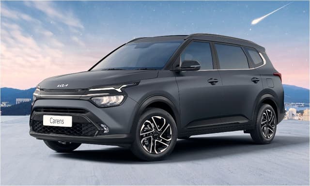
KIA
KIA revealed its brand-new logo at the Geneva Motor show in 2019. Through the re-branded logo, the Korean auto manufacturer attempts to be considered a leader in technology and also look more aspirational. The latest radical design emits symmetry and rhythm.

Photo Credit: www.seltosforum.com
Peugeot
The latest change in Peugeot's logo marks the 11th update to the auto manufacture's lion emblem. The dramatic shield-back design is one of the significant changes in the new logo. The logo also uses bold black and a detailed lion's head.

Photo Credit: en.wikipedia.org
Nissan
Nissan revealed its all-new simplified 2D logo back in 2020. This auto brand also seems to be following the trend of flattened 2D design. The brand claims that the logo is connected to its tradition of innovation and rich heritage. The Nissan Ariya electric crossover was the first model to feature this logo.

Photo Credit: ww.carlogos.org
Audi
Audi was one of the first ones to pick up the 2D logo design trend in March 2018. The brand logo still retains the iconic “four rings” but has ditched the silver colour and 3D design. Audi refers to this latest updated logo as a “digital-first” logo.

Photo Credit: www.audi-mediacenter.com
Renault
Renault decided to present its updated logo with the launch of the Renault 5 Prototype. The latest emblem embodies the concept of “nouvelle vague,” which means a new wave. The new logo is synchronised with the brand's latest, modern, and vibrant vehicle range.

Photo Credit: www.renaultgroup.com
GM
GM recently announced its new slogan, "Everybody In," along with its fresh and brighter logo. This new logo came after the company's commitment to zero emissions, zero crashes, and zero congestion. The logo evokes a sense of "clean skies of a zero-emission future."

Photo Credit: gmauthority.com
Mahindra
The “Twin Peak” logo of Mahindra was a significant modification over its existing emblem. This change is Mahindra's attempt at creating a distinction for its SUV lineup in its portfolio. The design creator claims that the idea behind the logo is to express a liberating feeling.

Photo Credit: logos-world.ne
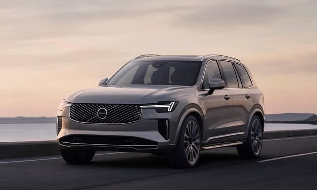
Volvo
Volvo joined the 2D logo design bandwagon in 2021. It got rid of its iconic “iron mark” logo. The new logo better represents the auto brand's venture into electric cars and digital space. However, the brand will continue to use the old logo till 2023.

Photo Credit: www.media.volvocars.com
Which of these new car manufacturer logos do you like the most?


